Lead Generation Landing Page Is Must For Startups And Why ?
The lead generation landing page is a must-have for your MVP. Why? Let me explain in 50 words.
Your landing page is a tool to kill two birds with one stone.
It’s a free, no-code approach to validate your business idea and find early adopters.
Also, it’s a reliable marketing tool to collect customers’ data in exchange for valuable materials like eBooks, white papers, or free templates.
In detail, a lead generation landing page is like your Internet business card.
The primary purpose of the landing is to collect personal information of potential customers, leads. It would help you to “warm-up” these people to transform them into payable customers as soon as they showed interest.
Because if there are no leads, there are no sales. But how to create an effective lead generation landing? Do not worry. There is a way.
But first, let’s take a closer look at what I want to discuss:
- What are landing pages ?
- Why do you need a landing page ?
- How does landing page work ?
- Examples of effective lead generation landing pages in 2020
- How to create a sensational landing page ?
What Are Lead Generation Landing Pages?
The landing page is a single page or one of the pages of your website where users “land” after clicking on an ad or a social media post. The landing page could be a product itself and significantly cut the cost of an MVP.
This page is all about making users do their first action: subscribe, sign up, leave an email address, or make a purchase.
You see that page while scrolling through Amazon Prime. Or when you consider signing up as an Uber driver. Or while visiting the Snapchat website.
These landing pages show us how companies (frankly speaking, it could be any type of business) engage users in their products.
A landing page provides the customer with compressed, focused data to create a clear meaning of what a company or product does. And how to become a customer too.
These lead magnet landing pages aim to attract the attention of not-a-customer, build trust moment, and convert this person into a potential customer.
Landings are an essential part of a marketing flywheel (modern marketing specialists do not use “funnel” anymore). People you aim to attract are just at the awareness stage of your service or product.
And the landing page should catch this aha moment to involve people in your marketing.
Collecting data is the easiest way to start a leads warming-up campaign. Simply because with any sort of data, you could begin to build trust with your brand, provide value, and qualify leads to close a sale.
Usually, to qualify a lead, it is required to offer to fill out the conversion form. It’s a free form available to any visitor on the website. But to make form truly convertible, founders (or marketers) use the following:
- Free webinars or courses
- Detailed white papers or guides
- Free E-books and reports
- Overview of case studies
- Step-by-step checklist
- A free product demo, and so on
- So, if to sum up, what is a landing page at all?
It’s a potent marketing tool with no complex features and a single primary action. It helps to drive traffic on your website.
The well-made lead generation landing page is a must-have for an early-stage startup founder. It’s a crucial tool to validate an idea and identify the customer’s willingness to pay without spending a penny.
However, let’s take a closer look at reasons to start with building a landing page.
Why Does Your Startup Need to Use Lead Generation Landing Pages?
There are many benefits of using a landing page as a driver of your project’s marketing and sales. Thus, there are many reasons to spend resources on well-made landings. But I consider these 3 to be the most important:
Landing pages test the value level of your offer.
The trick of landing pages is simple – there is the only “shine thing” to catch up visitor attention. In terms of startup building, that means that the landing page is a test polygon for your business hypotheses.
Did you identify the real problem on the market? Did you wrap it attractively enough? Did you offer enough value to give a shot for your product? Did you address the relevant audience?
All these things are much easier to test in the controlled, almost laboratory conditions that the landing page provides. For example, you decide to build own taxi app. How to make sure it would be interesting for your specific target audience? Start with a landing.
Landings boost up your conversions.
Take a look at your homepage. If you still don’t have it, just recall a few of your favorite homepages.
What do you see? I’ll tell you — many blocks with a different context. For sure, all these content blocks are required. In the complex, they build trust and brand awareness. But such design doesn’t push a customer to become a lead.
In contrast to a generic homepage design, a lead generation landing page is designed to let the user do a single & specific action. And this kind of strategy is much more effective.
Of course, many different factors influence customers’ behavior like industry, product or service, design. The truth is that landings are subjective. If you did it right, it would boost up conversions.
Lead generation pages lower acquisition costs.
Let me clarify the meaning of this statement.
The mere fact that you make a landing page for your site does not mean anything. But the way you would use it defines the final acquisition costs.
I mean, things like A/B testing, a complex configuration of ad campaigns, retargeting, and other promotional tips define the unit economics of your startup.
The basic (and obvious) way to make acquisition cheaper is a long-term strategy. Your ad campaign expenditures will be the same, while conversions will be higher. But only if you optimize the design and content to make it clear and engaging.
How Does Landing Page Work?
The basic principle of landing page functionality is an exchange.
See, as a founder, your goal is to share as much value as possible using your product. Marketers face the same challenge. And the landing page is the most common channel to build such kind of communication.
It’s a win-win situation: you share valuable information, while visitors share personal data.
It comprises simple mechanics:
A site visitor is caught by a call-to-action: button, form, or pop-up form.
A site visitor does the target action: clicks the button or fills out a form.
A data of that particular visitor goes to your CRM system, even if it is a Google Spreadsheet.
You start warming the company to push lead through all marketing stages.
As a result of that flow, the nurtured lead becomes an MQL – Marketing Qualified Lead. At this point, it becomes available to track the lead status through all marketing stages and cooperate with the sales team to close deals.
4 Lead Generation Landing Page Examples [To Follow]
At this point, it’s clear that the lead gen landing page is an action-focused page of your website. These pages can be used at different stages of marketing & sales activities.
Hence, let’s take a look at good lead generation website examples and analyze their pros and cons and find out what you can use for your own startup.
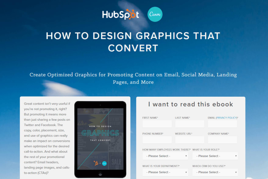
The eBook promo landing page by HubSpot and Canva

What company did right:
A clear context and message in “How To” headline
A good page structure – a content and an action area are separated
Visualization of the final result in an image
What they could test:
Make a form shorter, because too many fields look boring
Change background visual. It’s about zen, but less about graphics
Try to make a clean design with much empty space around key zones
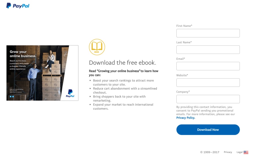
The eBook promotion by PayPal

What company did right:
“Download the free eBook” is clear enough to understand the no-cost offer
CTA is contrasting and catching the attention
A good text structure that uses a bulleted list
The image makes offer stronger, as “after reading” results show
What they could test:
Try to customize the CTA, because “Download Now” is too generic
Make text on image readable
Cut off the PayPal logo, since by clicking the logo you open the homepage
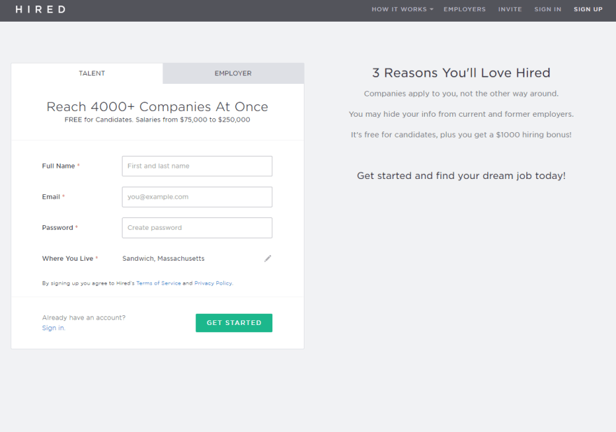
The registration page by Hired

What company did right:
The texts are neat. The headline shows the solution to the primary problem, while subheading emphasizes the additional values
The CTA is set against the background
Bullet list makes the text easy to understand
The form is short
What they could test:
Cut off header and logo, as these elements make urge the user to leave the page without action
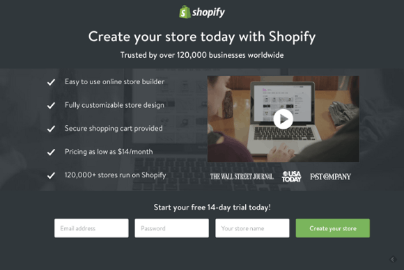
The registration landing by Shopify

What company did right:
An attractive and catchy CTA button set against page colors
An ideal single-CTA approach
An excellent example of UX-focused writing on the button, as “Start today” emphasizes benefits
What they could test:
Hide the logo to make sure visitors won’t go to the homepage before doing target action
9 Building Tips For a Landing Page That Converts
At the heart of any landing page lies in-depth research on what to offer and how to make it attractive.
The approach may vary depending on the specifics of your industry, target audience, and product.
However, there are universal tips on how to make your landing page a real lead-magnet.
So, what should a landing page include?
A catchy-as-hell headline. It isn’t an easy task. However, there is a clear and straightforward acceptance criterion. Create a headline that would converge your own attention quickly enough. It should be both clear and concise.
The bad example of a headline is “SaaS Solution To Automatically Respond All Your Leads.”
A catchy example of a headline is “Close up to x2 more deals with simple two-clicks integration.”
A definite page structure (which is one more uneasy task). If you have ever heard about the blink test, you’ll get what I mean. The goal is to build the page that would highlight the most important info in a single eye blink. The user behavior patterns and landing page templates help you to deal with it successfully.
Bullet Points. The reason to put such kind of list in your page is as easy as pie. It signals our brains to read faster. This form of text engages visitors and make them interested in what you have to say. Also, the short text is more mobile-friendly than long texts.
Different conversion forms. When I say “different” here, I mean “according to the particular marketing stage of the lead.” Just put yourself in a visitor’s place. Would you like to fill out long forms with many inputs for some unknown content? I think you wouldn’t. But the further you push the lead, the more data to work with you get.So keep in mind that you should collect data wisely. More value = more trust = more personal data. Exactly this order.
Delete navigation. Lead generation page with navigation unfocus user and enable him or her to avoid target action. It is obvious. However, many companies forget that point.
Use high-quality visuals. There are no guarantees that people would spend their time reading whatever you wrote. Images are much easier to understand. Basically, images are more captivating. So invest your resources in designing and try to use relevant and well-made graphics.
Social sharing. Yeah, I have already told that this element is not the right decision. It might be if you make social media to open in a new tab or window. Thus people will promote you without losing focus.
Social proof. Put testimonials and case studies with an interview of your real customers. There is no better signal to a visitor than honest feedback on the user experience and values of your product. However, you need to make sure that testimonials correlate with what you are going to promote.
Well-made user experience. It isn’t precise advice. What I mean here is that you need to ensure that each next step is described clearly and in a friendly tone. Do not use the standard “Download now.” Better say “Start converts” or “Get free eBook”.
Conclusion
After all, there is no magic receipt on how to build a super lead-generating landing page. Instead, there are many tips on how to make results better and better. At least, these points have helped other startups to grow.
Hence, there is one more tip. Test your lead generation landing page as accurately as possible to find the best combination of content, design, and CTA for your product.
It’s the only way to make sure you’ll drive marketing and sales effectively.


Add comment